Brand Design: Herbal Tea Company
The Objective
Create a comprehensive visual identity and packaging system for The Herbal Haven, a premium botanical brand specializing in organic loose-leaf teas and herbal remedies. The goal was to establish a "modern apothecary" aesthetic that feels grounded and artisanal while remaining technically optimized for sustainable business growth.
The Challenge
The client required a brand system that could transition seamlessly from large-scale retail packaging to tiny, high-detail applications like tea bag tags and lid seals. Initial icon concepts featured intricate mesh details that risked "bleeding" or losing clarity when printed at small scales.
The Outcome
A versatile, production-ready brand identity that maintains its premium feel across all touchpoints. The final system provides the client with a professional hierarchy of logos, allowing for consistent branding on everything from large shipping crates to delicate glass apothecary jars.
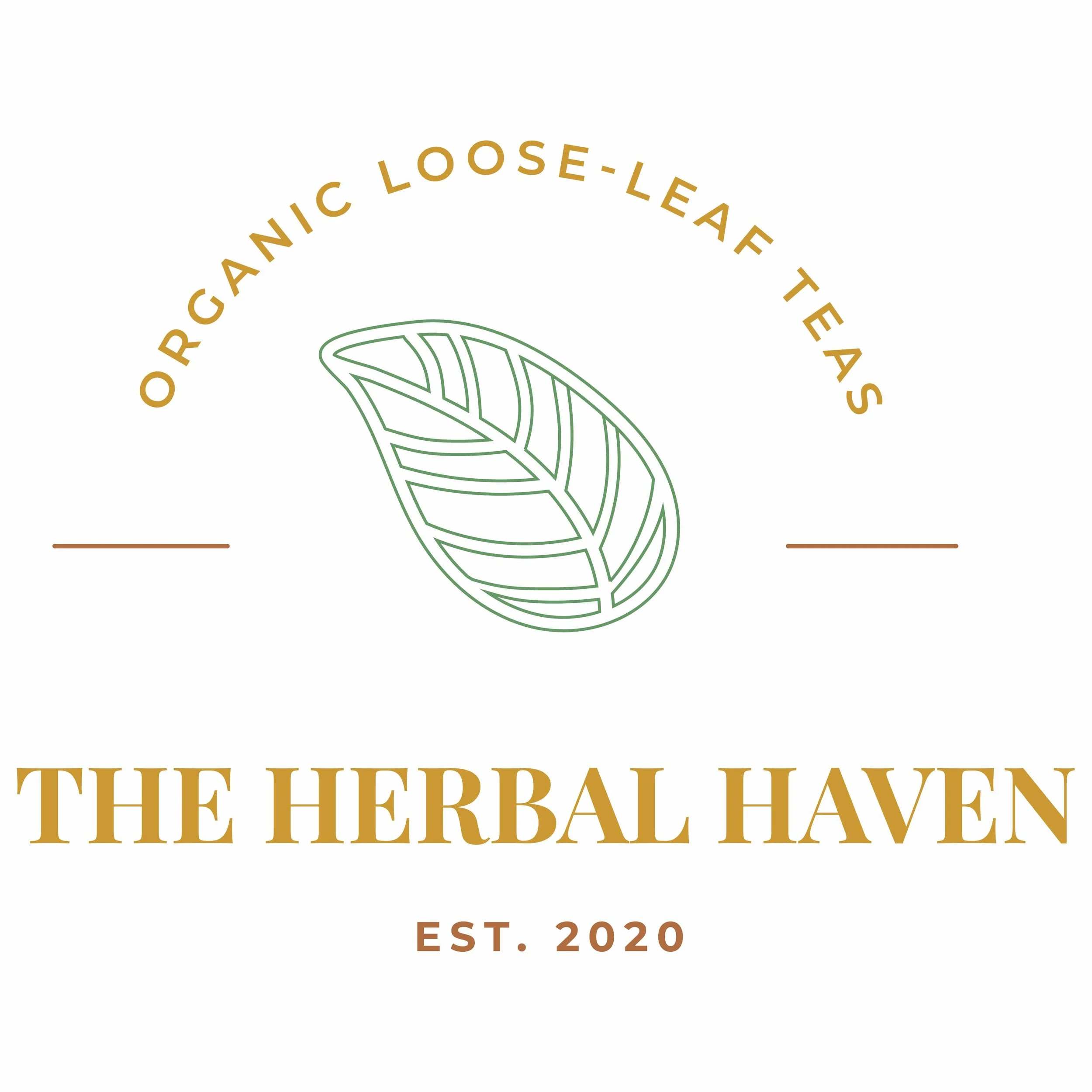
Dominant Logo: Organic Authority
The primary logo serves as the cornerstone of The Herbal Haven's identity. It features a stylized leaf icon that emphasizes the brand's commitment to natural, organic ingredients.
Design Rationale: The curved "Organic Loose-Leaf Teas" typography creates a seal-like feel, establishing an immediate sense of trust and established quality.
Visual Hierarchy: By placing "THE HERBAL HAVEN" in a prominent, classic serif font, the brand name remains the focal point, ensuring high recall for customers.
Application: This version is designed for maximum impact on primary packaging, such as the front of tea tins and retail bags.
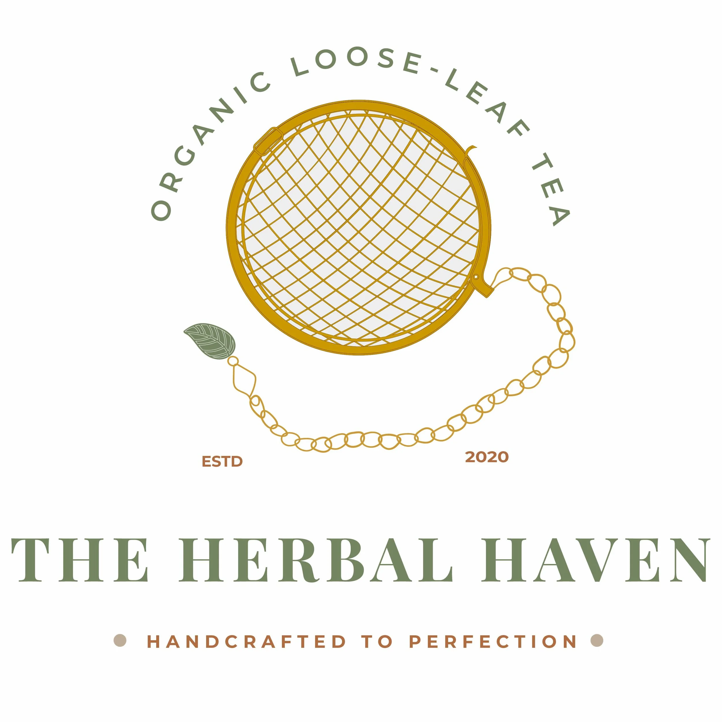

Secondary Logos: Versatility in Detail
To ensure the brand can scale across various platforms, a suite of secondary marks was developed to handle different spatial requirements.
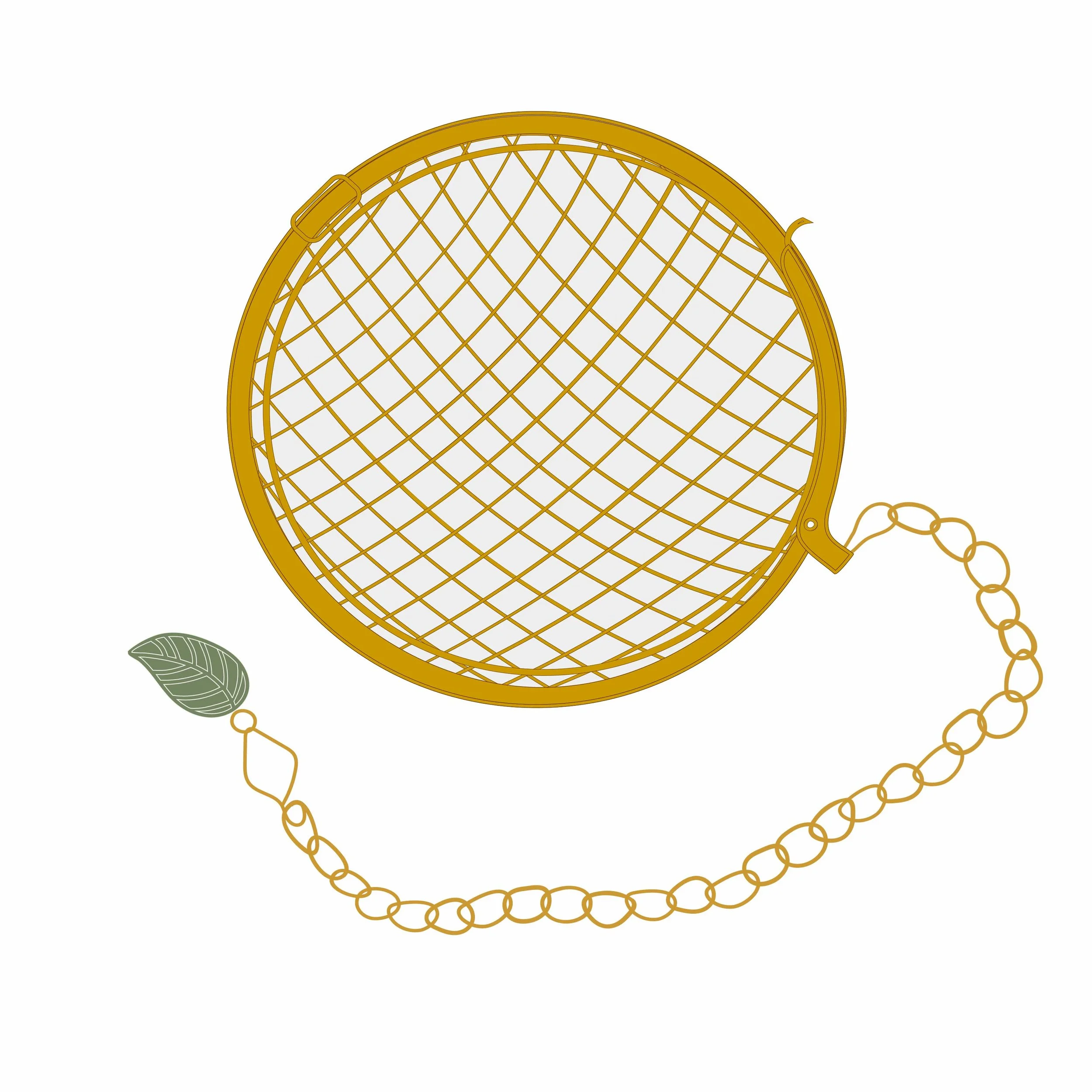
The Infuser Mark: A secondary logo featuring a simplified tea infuser was created for brand depth. This icon was specifically refined to maintain clarity at smaller scales, such as social media avatars or shipping stickers.
The Leaf Submark: A standalone version of the leaf icon provides a "minimalist" option for small-scale applications like tea bag tags or wax seals.
Circular Label Variant: A decorative roundel with a dotted border was designed specifically for lid stickers and "quality seal" applications, adding a premium, handcrafted touch to the packaging.