

Brand Design and label development
Project deliverables: Logo system, color palette, typography and label mockups.
The primary logo is a detailed, illustrative mark that captures the artisanal soul of the brand. Centered around a hand-carved wooden spoon overflowing with turmeric, peppercorns, and fresh herbs, it serves as the most "artsy" expression of the brand's origin.
Design Strategy: This mark is reserved for high-impact brand moments—such as website headers and storefront signage—where the intricate textures of the botanical elements can be fully appreciated.
Typography: The arched "Spice Essence" wordmark utilizes Metallophile Sp8 Medium to provide a vintage, weathered feel that complements the tactile illustration.
To ensure the brand remains functional across all mediums, I developed a suite of secondary logos that simplify the primary elements into cleaner, more scalable formats.
Iconic Continuity: By focusing on a single hero element—the star anise—these marks maintain brand recognition in tight spaces like social media avatars or smaller packaging panels.
Layout Flexibility: I provided both horizontal and vertical lockups to allow the brand to adapt to varying spatial constraints without losing its signature "apothecary" aesthetic.
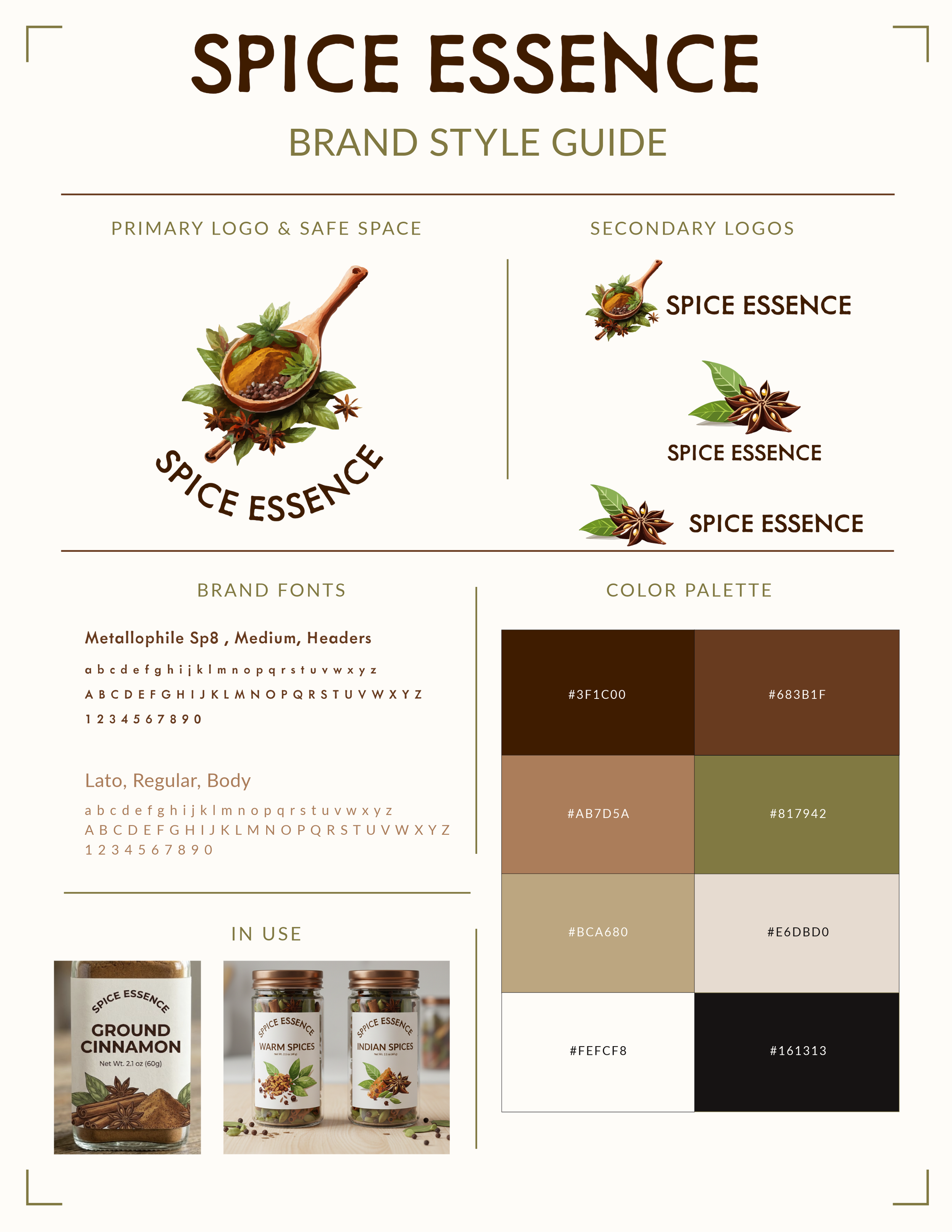
The style guide serves as the "blueprint" for the brand’s visual consistency. It includes a carefully curated color palette, clear typographic hierarchy and “in-use” case studies.