BRAND DESIGN: Small fitness studio
Project Overview: Flex Fitness Studio
Flex Fitness Studio is a boutique wellness space dedicated to mindful movement. The goal was to move away from the "hardcore," aggressive aesthetics of traditional gyms and instead create a warm, welcoming, and feminine brand identity that resonates with clients looking for strength through balance.
The Challenge
The client needed a visual system that felt approachable but professional. The brand needed to bridge the gap between high-energy fitness and serene mindfulness, ensuring that the visual language remained consistent across digital platforms and physical studio touchpoints.
Logo Design & Symbolism
The Flex Fitness logo is a minimalist, abstract mark designed to evoke fluidity and human form.
The Icon: The icon features organic, sweeping curves that mimic a person in a yoga or Pilates pose. The upward trajectory of the lines represents growth and personal empowerment, while the circular element provides a focal point of "zen" and centeredness.
The Composition: By using a dominant horizontal weight at the base, the logo feels stable and grounded—essential for a brand focused on foundation and strength.
Adaptability: The system includes a dominant horizontal lockup for web headers and secondary stacked versions and a standalone icon for social media avatars and merchandise.
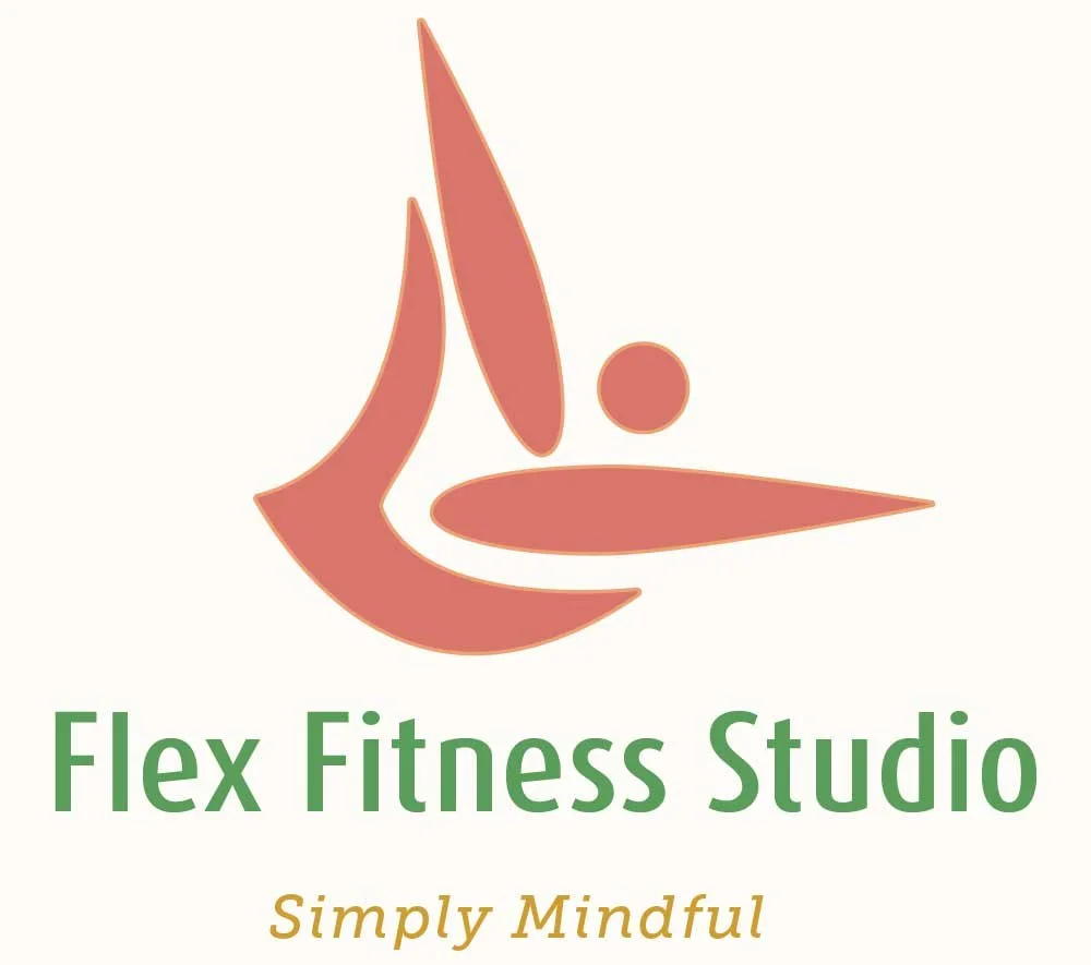
Dominant Logo


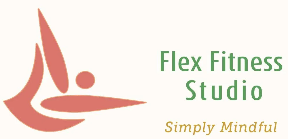
Secondary Logos