

Logo Development: From Simple Concept to Rugged Emblem
This project for an outdoor gear company required a logo that felt both authentic to the wilderness and unique among competitors. Our process moved sequentially from a foundational sketch to a final, intricate design, ensuring every detail was intentional.
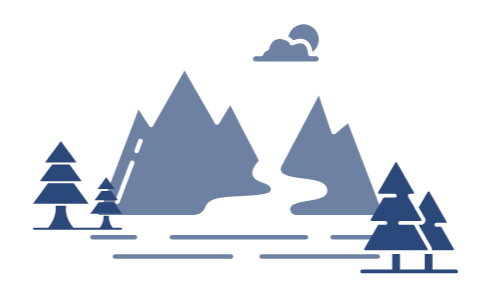
Phase 1: The Concept (Drawing)
The journey began with the core idea: a scene that captures the spirit of exploration. The initial concept (left) uses simple, geometric shapes and flat colors to quickly establish the key elements—the mountains, the river, and the trees. This stage is about setting the visual blueprint and determining the composition without getting lost in detail.
Phase 2: The Build (Refinement)
Once the concept was approved, the focus shifted to refining the composition and defining the visual style. We moved away from the simple, flat vector shapes toward a more rugged, engraved aesthetic. This phase involved:
Introducing fine linework and contrast to the mountains to suggest texture and scale.
Integrating the final color palette (dark blues, deep greens, and natural taupe).
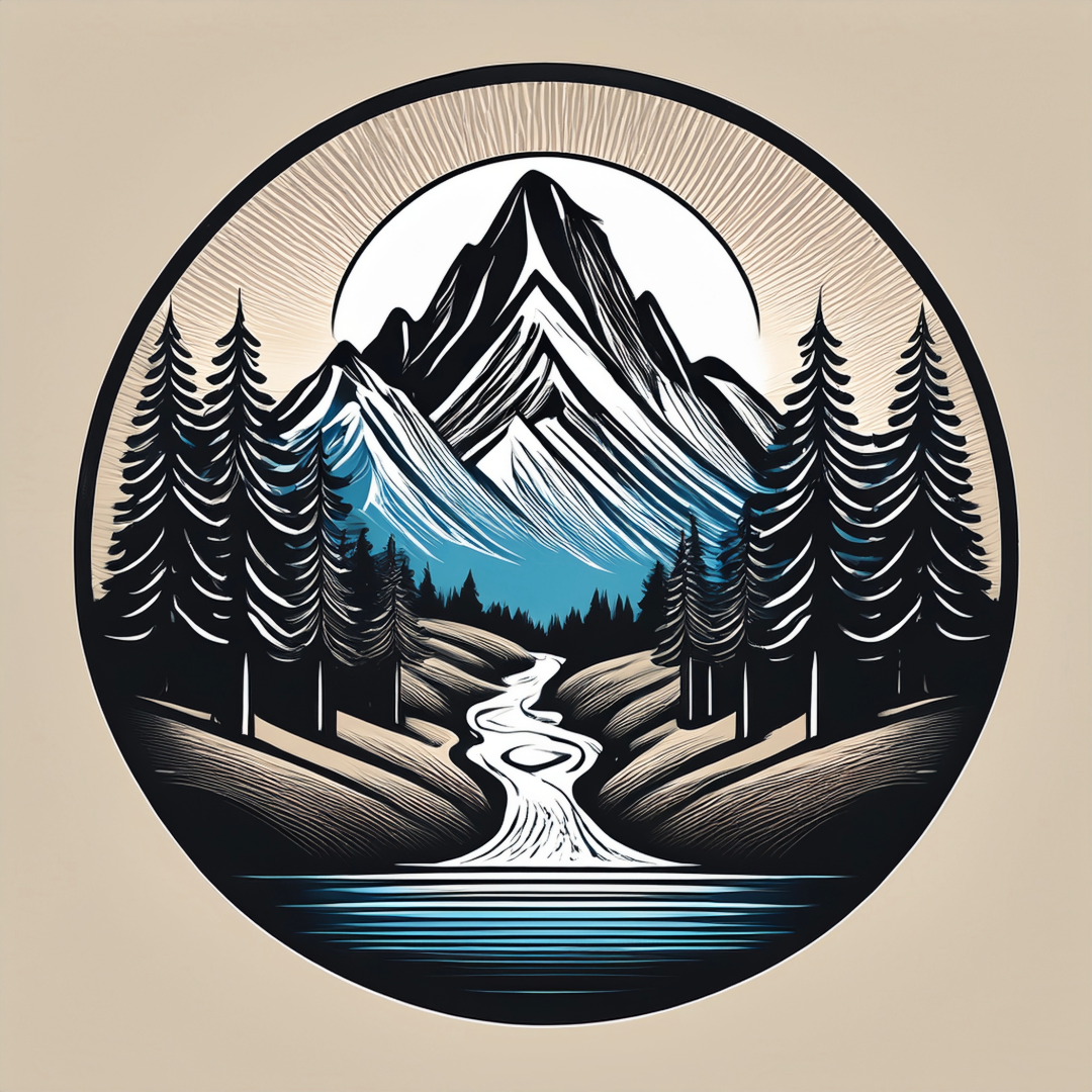
Phase 3: The Final Design (Growth)
The final emblem (right) represents the full growth of the idea. It is a detailed, versatile mark that successfully captures a complex outdoor scene within a simple circular frame. The result is a logo that feels like a classic, high-quality badge—perfectly communicating the company's commitment to quality gear and the spirit of the journey, ensuring the brand stands out as a genuine authority in the outdoor market.