

Logo Development: Defining a Neighborhood Microbrewery
The goal for this microbrewery was to create a logo that felt instantly recognizable to locals while conveying the high quality and craftsmanship of their beer. We presented two distinct concepts, allowing the client to choose the foundational visual focus of their brand. The second iteration is under construction but will be a community icon once completed.

Iteration 1: brand identity
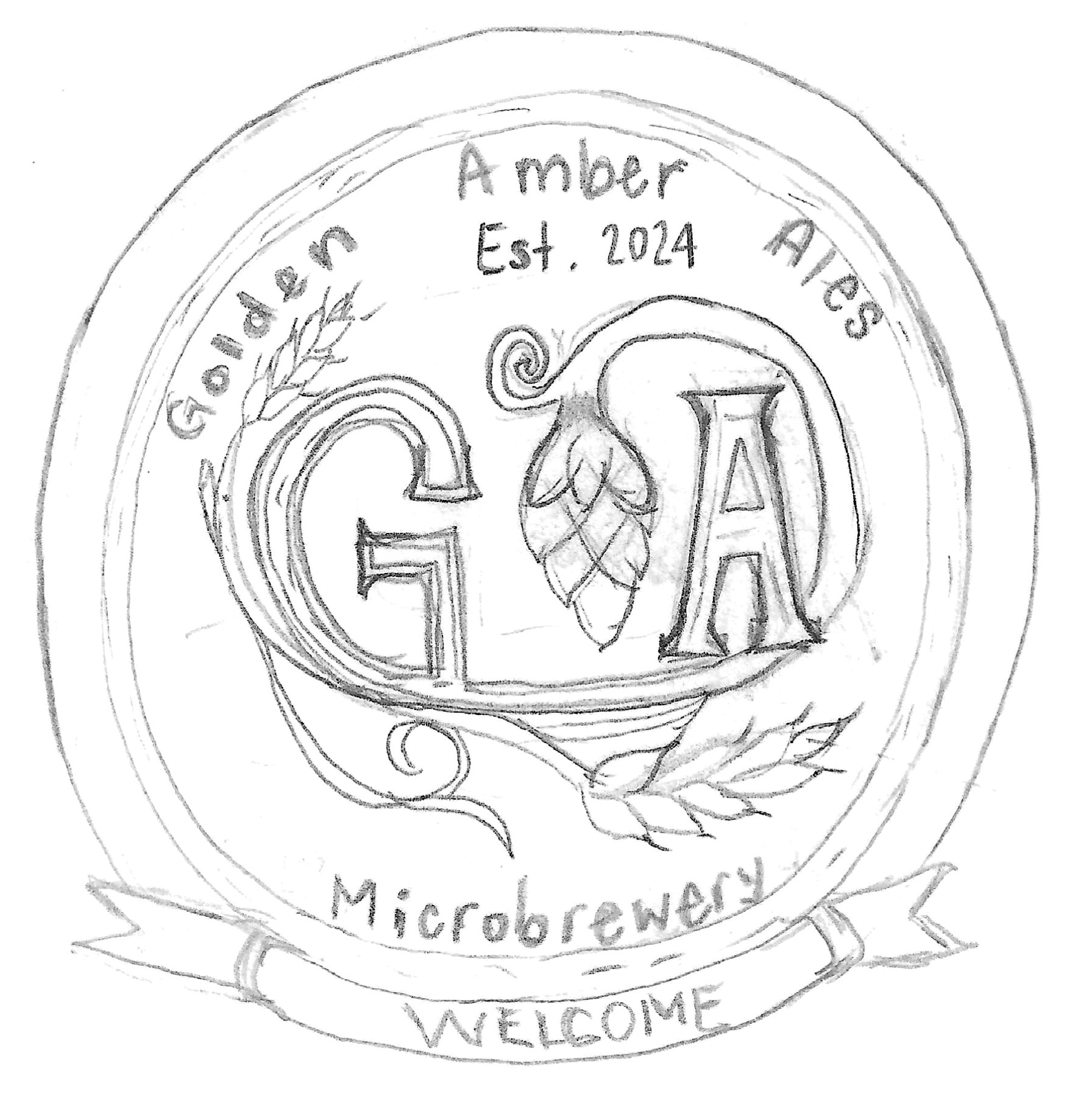
As with all my designs, the process begins with a sketch! This is the original design of the logo utilizing the G & A from the name. The next step was to build this in vector form. After some thought and review, I decided to go another way to better promote a “neighborhood” brewery/pub. See iteration 2 below.
This iteration focuses on establishing a classic, authoritative identity through the brewery's initials.
Focus: Identity and Heritage. This design uses a detailed, circular badge format, instantly evoking traditional brewing seals. By intricately weaving the hop cone and wheat into the "G" and "A," we ensured the core business (ale) is integrated directly into the brand's name.
Strategic Value: This option offers a more refined, upscale feel, suggesting a long-standing commitment to quality.
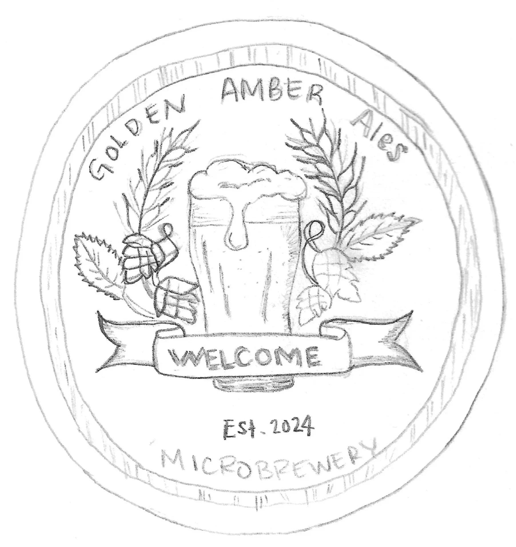
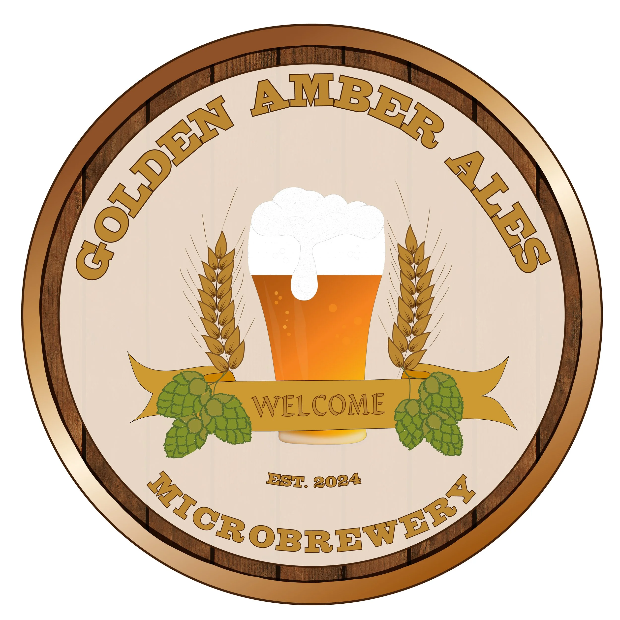
Iteration 2: A Community symbol
I preserved the core elements and changed the monogram design to a pint glass to better connect with the local community feel. My goal was to promote this business as a place where “everybody knows your name.”
This second direction shifts the focus from the monogram to the product and community experience.
Focus: The Product and the Local Gathering. This design will feature a central pint glass, the universal symbol of enjoyment and community, surrounded by cascading hops. This approach is often more approachable and celebratory, directly appealing to the local consumer's experience of drinking beer at the brewery.
Strategic Value: This option is highly scalable and immediately communicates what the client offers, making it a perfect, friendly icon for merchandise and signage in the local area.