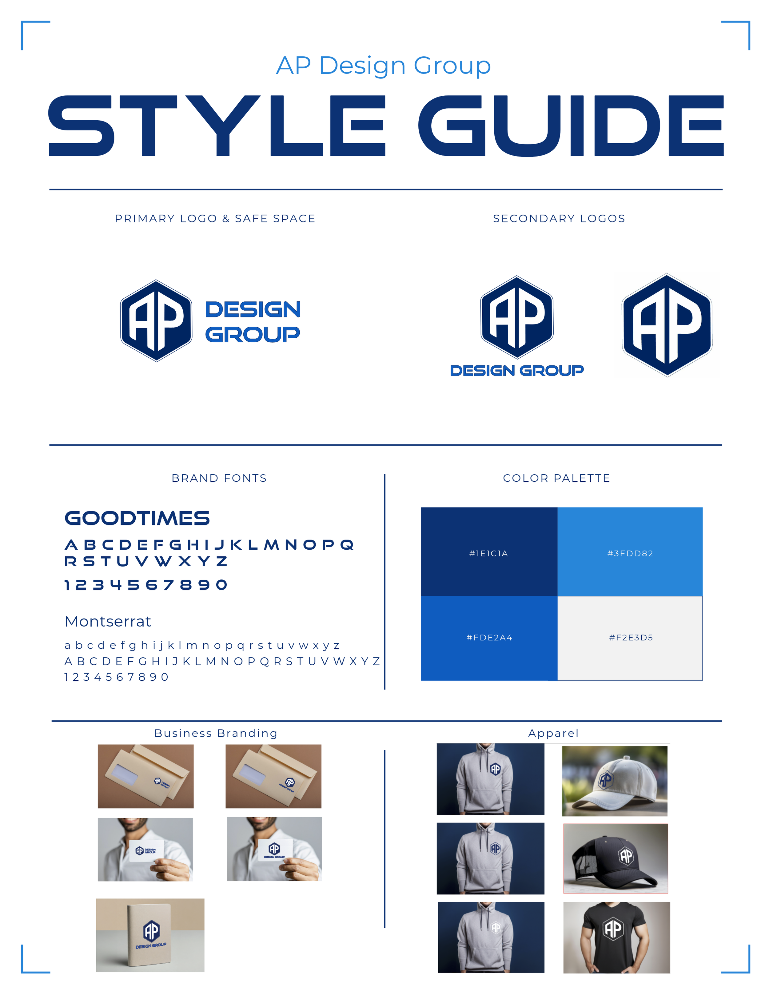
Brand and Website redesign: Enhancing Precision and Versatility
This project required a strategic redesign of the existing logo to better represent the firm's modern design elegance and versatility across projects.
The Challenge: Moving Beyond the Initial Structure
The original logo (far left) was created using a 3D, structural design that, while referencing engineering principles, was visually heavy and lacked versatility. The complexity of the 3D angle and internal shadows made it unsuitable for small applications, print materials, and digital use, hindering the firm's professional image.
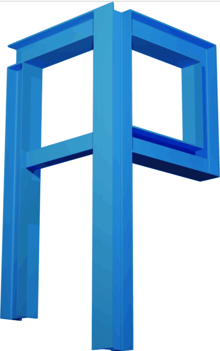
The Project: This process demonstrates how we strategically refine an existing identity to ensure the final brand mark is not just aesthetically pleasing, but functional for all modern business needs. This is the original brand mark which is a literal representation of their industry. The client has experienced growth and diversified their services beyond engineering. This developed a need to refine their logo to represent them as a growing and evolving firm.
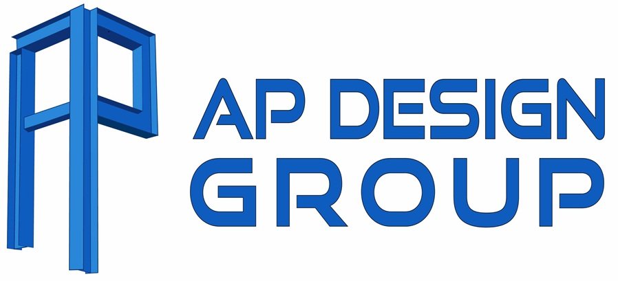
The first step in the process was to cleanup the original version into a simple flat design.
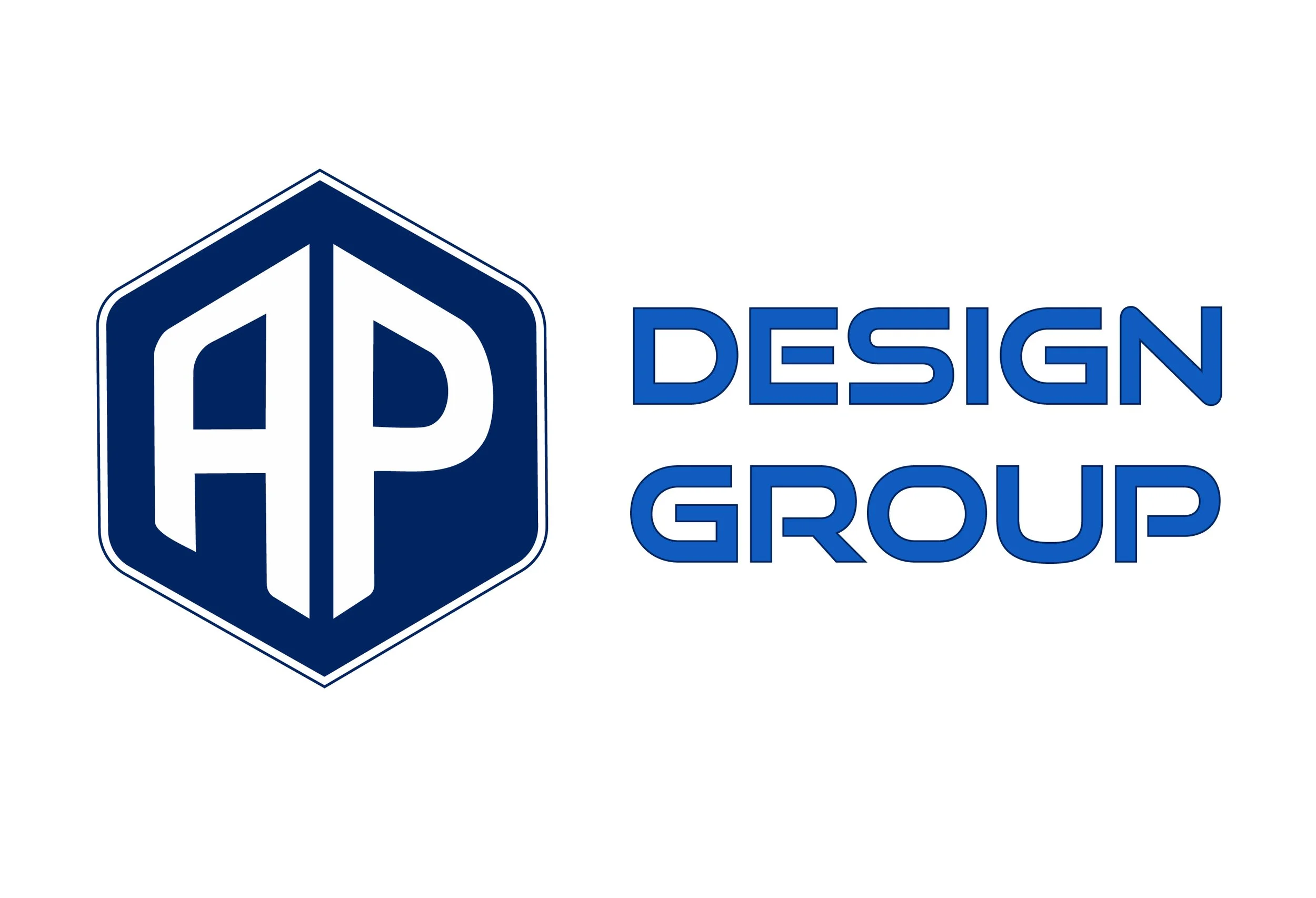
The Hexagonal Emblem. This route maintains a structural, geometric feeling using a bold hexagon. It speaks to precision and strength but still felt slightly restricted by the heavy container shape.