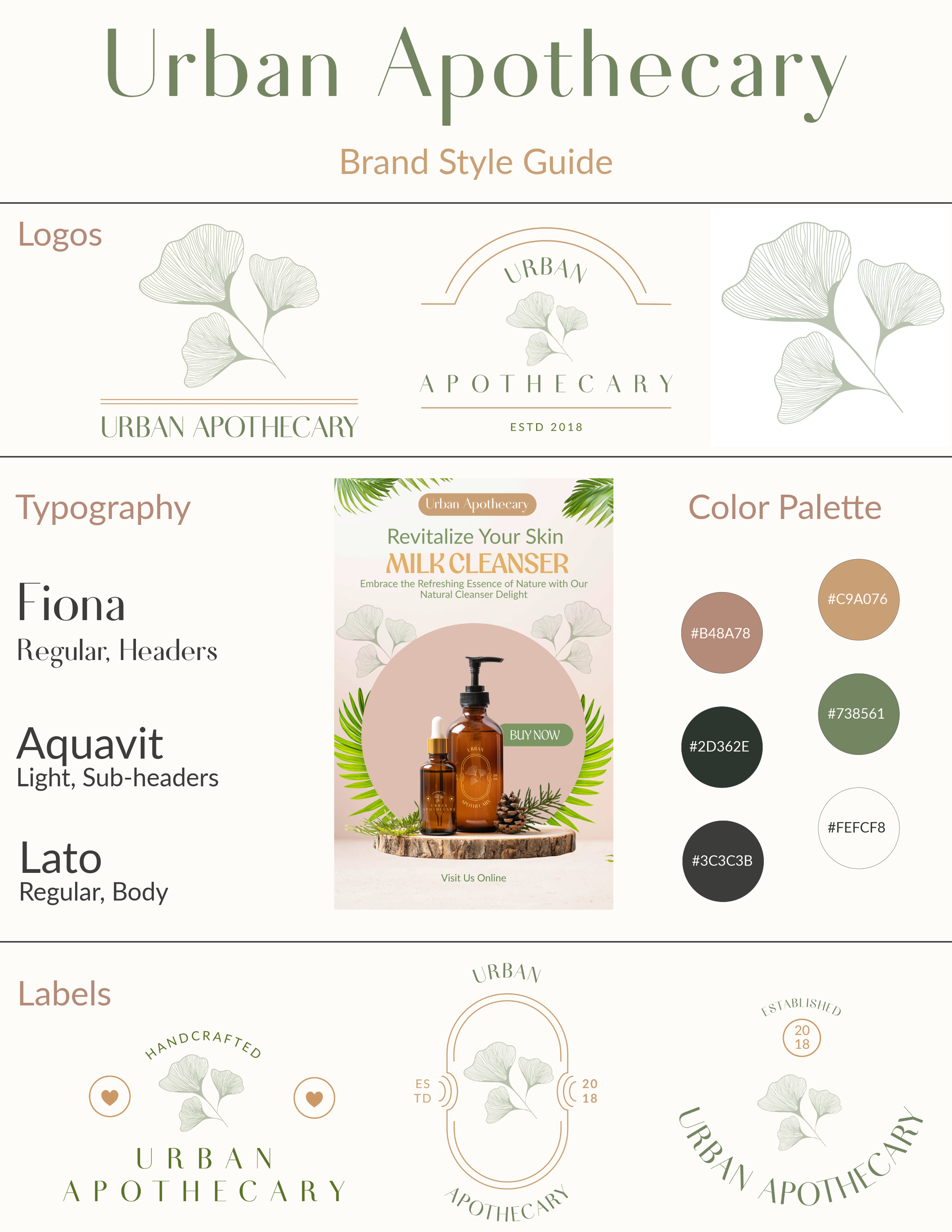
BRAND DESIGN: Urban Apothecary — Rooted in Nature, Designed for Modern Wellness
The Brief Urban Apothecary sought a visual identity that felt both "fresh" and "grounded." As a wellness brand, the goal was to create a brand system that signaled purity and botanical expertise while maintaining a warm, inviting atmosphere that doesn't feel overly clinical.
The Design Solution We developed a comprehensive visual language centered around the Ginkgo leaf—a symbol of longevity and resilience. The logo system uses fine-line illustrations and arched typography to evoke the feeling of a high-end, artisanal laboratory.
Color Palette: We curated a palette of muted sage, warm terracotta, and deep charcoal. These tones balance the "freshness" of botanical ingredients with the "warmth" of a boutique apothecary shop.
Typography: The pairing of Fiona (an elegant, high-contrast serif) with Lato (a clean, accessible sans-serif) creates a hierarchy that feels both sophisticated and approachable.
Logo Versatility: From minimalist leaf stamps to structured emblems, the logo system was designed to scale across diverse touchpoints, from tiny essential oil labels to large-scale storefront signage.
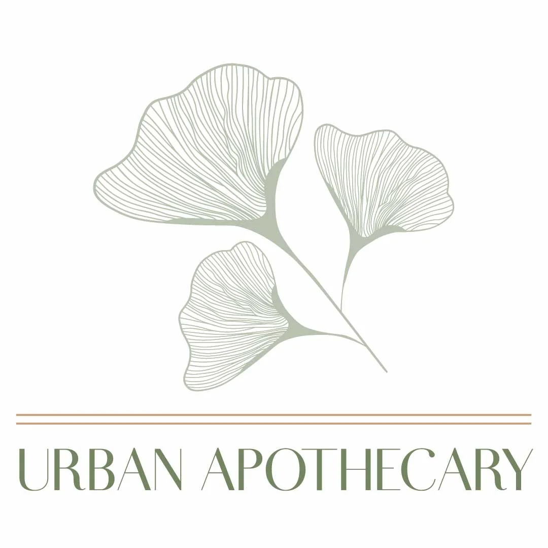
Dominant Logo:
The Ginkgo Motif: The use of the ginkgo leaf serves as a bridge between ancient herbalism and modern health, providing a recognizable organic icon that anchors the brand.
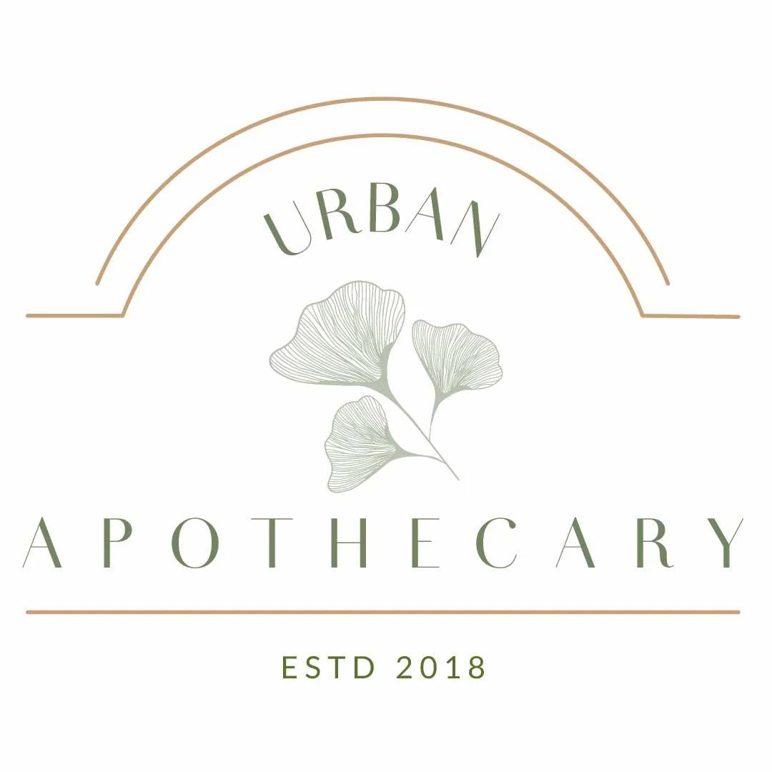
Secondary Logos